Full Branding
Summary:
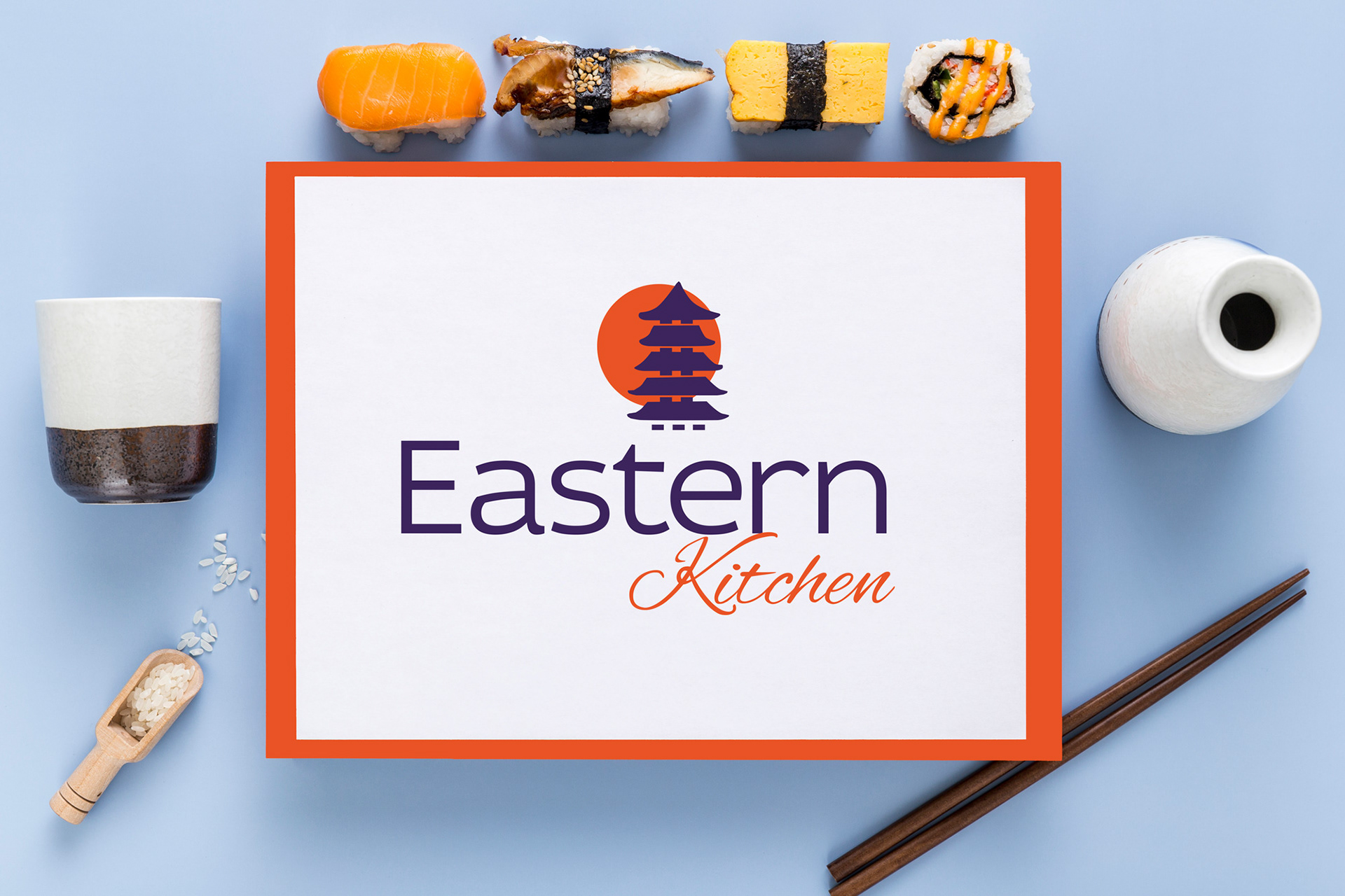
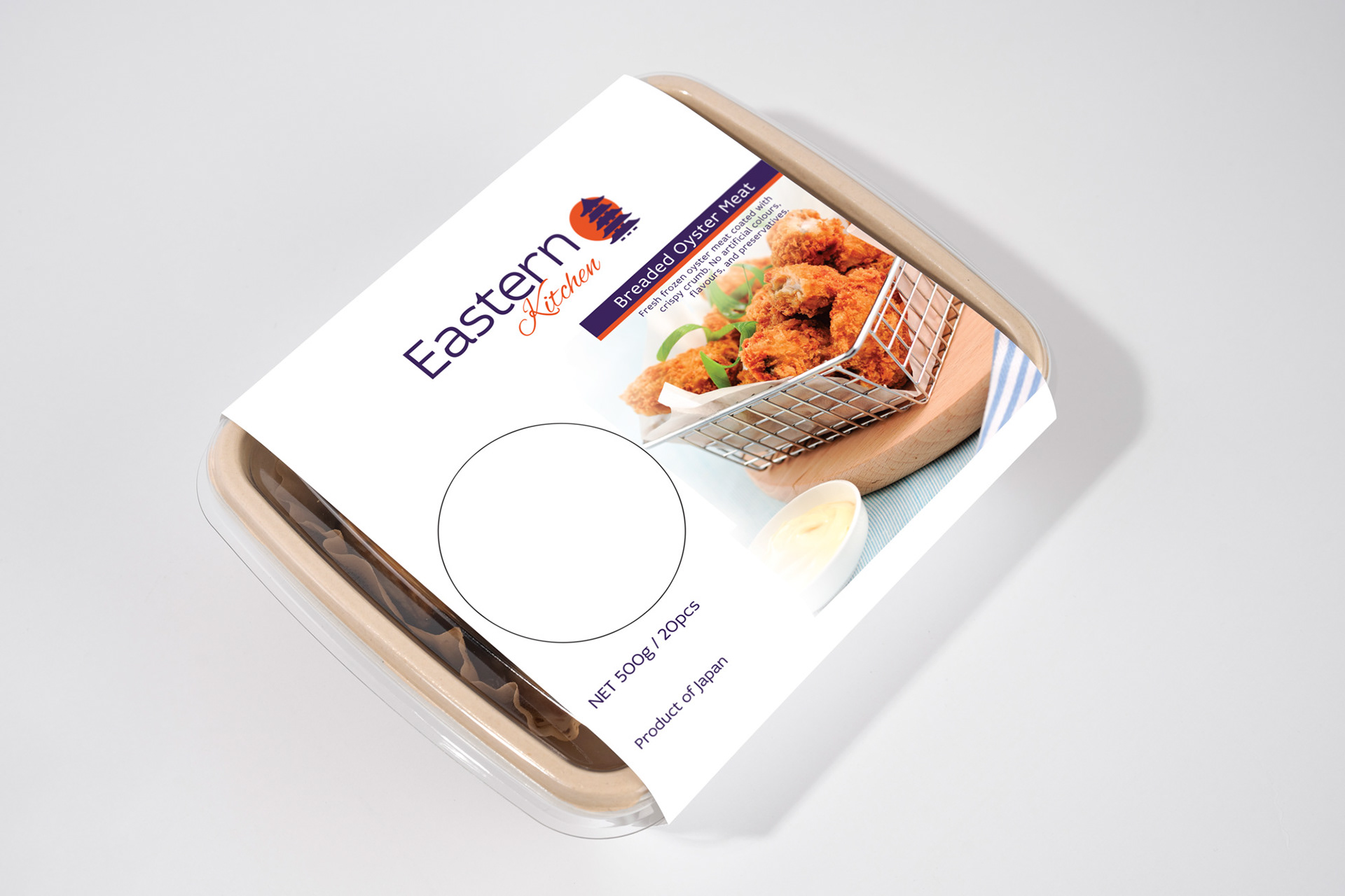
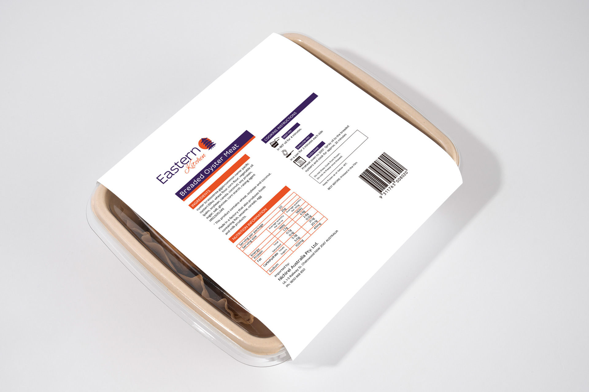
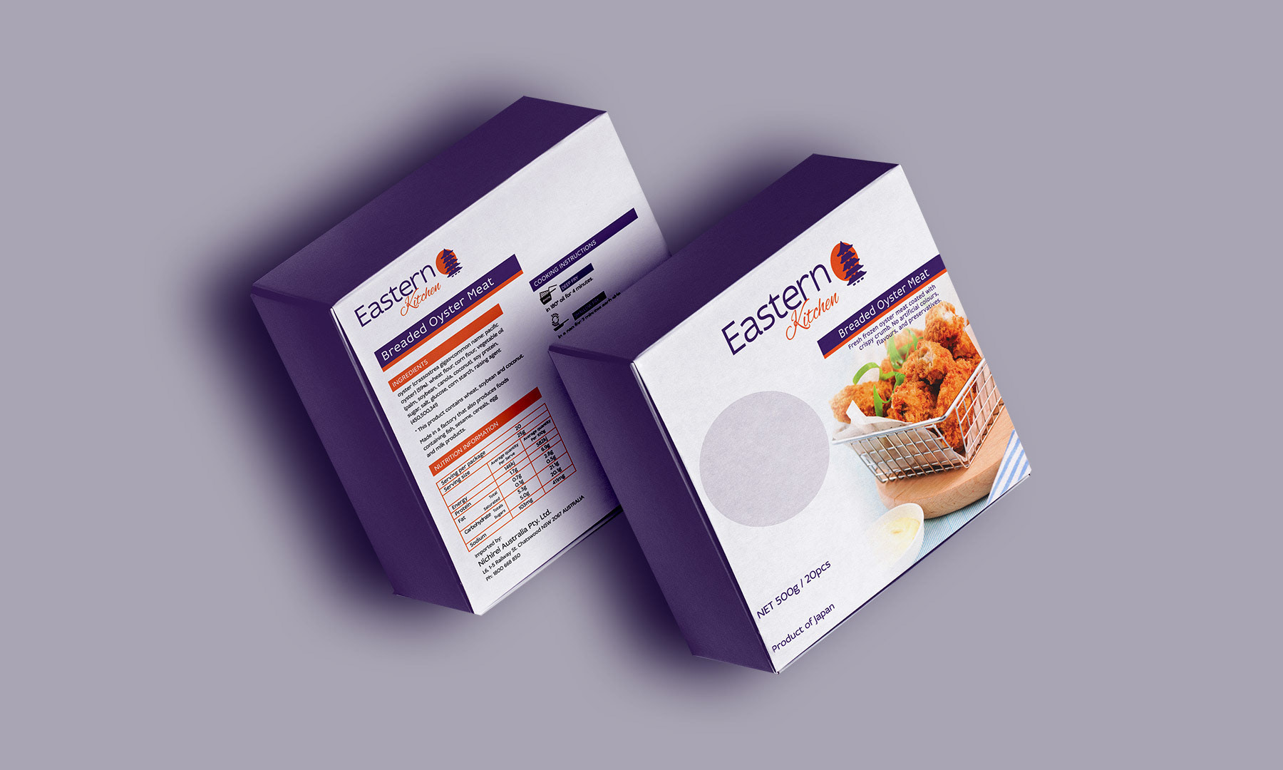
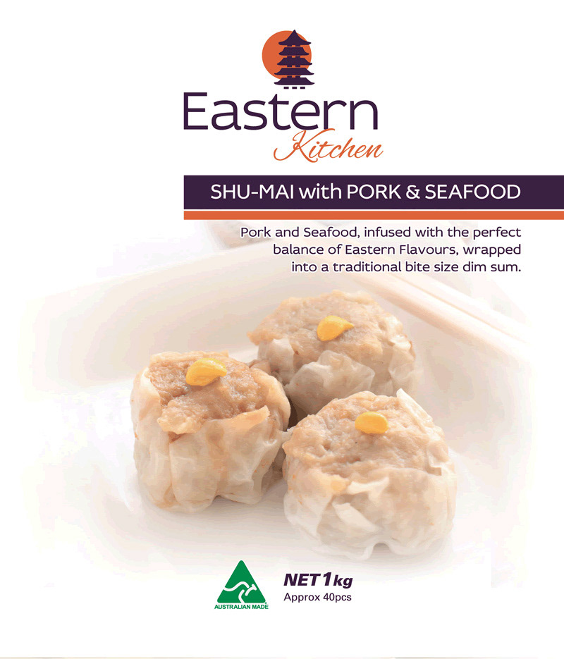
I had the honor of winning a competitive logo design contest for a frozen food company, which showcased my ability to deliver impactful and creative branding solutions. Following this achievement, I was immediately commissioned to design the packaging for the brand. Drawing on the brand’s vision and target market, I developed packaging that not only complemented the logo but also stood out on grocery store shelves. Each design element was carefully crafted to communicate freshness, quality, and the unique value of the product, ensuring it resonated with customers while adhering to industry standards. This opportunity allowed me to seamlessly extend the brand’s identity across multiple touchpoints, contributing to its market success.
The Problem:
The client, specializing in frozen Japanese food, faced the challenge of establishing a brand identity in a market where authenticity and visual appeal are key to attracting customers. As a new player in the industry, they needed a logo that would reflect the cultural richness of their offerings while also resonating with a modern audience. Additionally, they lacked packaging designs that could effectively communicate the quality and uniqueness of their products on store shelves, where first impressions are crucial for standing out among competitors.
The Solution:
To solve these challenges, I designed a logo that blended traditional Japanese aesthetics with contemporary design elements, creating a visual identity that was both authentic and approachable. I then crafted their first packaging design, ensuring it was visually striking and aligned with the brand's values. The design highlighted the premium quality of their frozen Japanese food while incorporating elements that appealed to their target market. These efforts provided the client with a cohesive brand presence, enabling them to connect with consumers and establish a foothold in a competitive market.
Category: Branding, Logo Design, Packaging